Ultra-modern workplace, Tokyo designed by Emmanuelle Moureaux Architecture
Design is playful but serious artistic – not typical for a bank! From the outside, this lively, filled with deep wells White Cube windows in different sizes and colors, each more vivid than the last. This color palette continues inside, where workstations are equipped with an inspirational, leaf motif and, of course, gnarled wood floors that invite nature on a farm revived this ultra-modern workplace. --
Homedesignfan.com
 |
| Source: miesarch.com |
'CIUDAD DE LEÓN' Auditorium, León, Spain designed by Mansilla + Tuñón Arquitectos
The auditorium is an exercise in realism whose small size is not only a guarantee of usage and economics, but also reduces its presence in the city. It is precisely this small-scale perception that lead to the exhibition hall being placed in a separate piece merging the historically established benefit of small foregrounds with the outlining of a new visual order. With the main volume relegated to the background, the section is extended until it becomes an elevation whose profile is lightened by placing more emphasis on the surface than on the volume itself. -- mies arch
 |
| Source: FG+SG – Fernando Guerra, Sergio Guerra archdaily.com |
Nursing home, Alcácer do Sal, Portugal, 2007 designed by Aires Mateus Arquitectos
The façade is reminiscent of a checkerboard, with its white surface punctured at intervals by recesses to shade its glazing. The long building meanders over the site, rising and falling with the topography of the landscape. A surrounding landscaped garden reaches up to the roof of at some parts, giving access to the top of the building. -- Dezeen
Read a post from
ArchDaily
 |
| Source: Oliver Llaneza archdaily.com |
Urzua Cofre House, Chicureo, Colina, Santiago Metropolitan Region, Chile, 2007 designed by Raimundo Anguita
The house plant is structured in the form of an “U”, gaining ground and conforming a yard that constitutes a intermediate space between in and outdoors. This ties up and illuminates all spaces inside the house. A place that allows perceiving the surroundings while keeping the privacy. -- ArchDaily
 |
| Source: José Ulloa Davet archdaily.com |
Metamorphosis 1, Tunquén,Casablanca, Chile, 2008 designed by Jose Ulloa Davet + Delphine Ding
The project is organized according to a new helical path which, through
the extension of an existing deck and the overhang of the new room,
allows the user to go up to two new panoramic terraces on the house. --
ArchDaily
 |
| Source: Indiga Ikhlasani archdaily.com |
Ira Residence, Surabaya, East Java, Indonesia, 2008 designed by Andy Rahman
The House is oriented towards to the East, where the wind blows from, East to West, this is our attempt as a potential entry into the design of this House. Formation of three-dimensional on the front facade serves as a ‘wind catcher’, so the House even without air conditioning will remain keep cool temperature. Because of the wind catcher is able to work optimally, so the air circulation inside house, can be optimal. -- ArchDaily
 |
| Source: Brigida Gonzalez mymodernmet.com |
Porsche Museum, Stuttgart, Germany, 2009 designed by Delugan Meissl Associated Architects
The fascinating impact of the monolithic, virtually floating
exhibition hall can be felt. This bold and dynamic architecture reflects
the company’s philosophy. It is designed to convey a sense of arrival
and approachability, and to guide the visitors smoothly from the basement level into the superstructure - this is how the architects express their dedication.
In their design, the architects
at Delugan Meissl set out to create a place of sensuous experience that
reflects the authenticity of Porsche products and services as well as
the company’s character, while also reshaping Porscheplatz with an
unmistakable appearance. -- official web site
Read a post from
My Modern Met
Read a post from
ArchDaily
 |
| Source: Francisco Mangado archdaily.com |
Archaeology Museum of Vitoria, Vitoria, Spain, 2009 designed by Francisco Mangado
....the façade fronting the lower street is more hermetic, and is made of an outer layer of opaque prefab pieces of cast bronze, with openings where needed, and an inner layer formed by a thick wall containing the display stands and systems. In this way the internal exhibition spaces are unencumbered and only traversed by translucent light prisms. -- ArchDaily
 |
| Source: Yiorgos Kordakis archdaily.com |
Moda Bagno/Interni Showroom, Athens, Greece designed by K-Studio
The street facade is clad with expanded metal and interspersed with openings to allow views into and out of the building. The cedar framework celebrates the openings and its intensified perspective form frames and gives direction to the views.
As the cars drive by the exaggerated perspective frames attract and intrigue. Their accentuated perspective allows for views from a wider range of angles, offering passersby more time to look inside whilst accelerating in their cars. -- contemporist
Read a post from
ArchDaily
 |
| Source: Tim Griffith archdaily.com |
Mission Bay Block 27 Parking Structure, San Francisco, California, USA, 2009 designed by WRNS Studio
Located within San Francisco’s Mission Bay redevelopment zone, this new seven story elevated parking structure serves adjacent laboratories and offices with 1,420 spaces. The north and east façades, which border a public plaza, are clad in perforated aluminum panels whose pixelation evokes California’s redwood forests and nearby foliage. Subtle folds in the panels further disrupt the monolithic surface and engage the pedestrian scale of the plaza below. The south façade, adjacent to a heavily trafficked street, incorporates a steeply canted plaster wall that dramatically registers sunlight and shadow over the course of the day. --
ArchDaily
 |
| Source: Roland Halbe archdaily.com |
Domus Technica: Immmergas Center for Advanced Training, Brescello, Reggio Emilia, Italy, 2010 designed by Iotti + Pavarani Architetti
The upper body of the building sits on a “heavy base” that roots it to the ground. It performs like a translucent compact volume inspired by the industrial vocations of the region. At the same time it tries to renew the area’s appearance by creating a more refined an evocative image of what is considered a “technical place”. The effects of the facade, created by light and weather conditions based on the time of day or the seasons, change the character of the Uglass finish which appears to have a transparent and diaphanous nature at times or viceversa, a solid and monochromatic nature at others. In the evenings, a lighting system is powered entirely by the energy produced from the photovoltaic panels and transforms the building into a body of light. -- ArchDaily
 |
| Source: Julien Lanoo Photographs archdaily.com |
MIDRAS, Destelbergen, Belgium, 2010 designed by GRAUX & BAEYENS architects
At the frontside of the building the architects chose not to break the strong horizontality but to enhance it instead by creating a balanced composition of stacked white volumes. The spacing between these massive volumes and the recessed windows creates an interesting number of vistas. -- ArchDaily
 |
| Source: Roger Frei archdaily.com |
Transformation À Charrat, Swiss Alps, Switzerland, 2010 designed by Clavienrossier Architectes
Volumes of visible tinted concrete replaced the double-sided roof and the transformed area. the big openings so created allow the light to penetrate more generously. The geometry of the superstructures results both from a formal desire and from a will to remove the wall thickness. The various-slopes faces enhance the highly varied game of the shadows throughout the day. -- ArchDaily
 |
| Source: Jesús Granada archdaily.com |
Malpartida House, Sevilla, Spain, 2010 designed by SV60 Arquitectos
The new façades to the backyard tries to reflect the density and deepness of the ancient walls and façades of houses and convents of Seville. Mass, void, light, material…The sort of perception of architecture that we are proposing bears mainly on these timeless values. -- ArchDaily
 |
| Source: Höweler + Yoon Architecture archdaily.com |
Sky Courts, Chengdu, China, 2012 designed by Höweler + Yoon Architecture
The roof geometry consists of a series of inward sloping roofs. The roof profile varies to create the impression of a landscape of peaks and valleys. The alternating inclinations of the major ridge lines produce a varied roofscape and cause the roof planes to twist. By maintaining a constant eave line and varying the perimeter, each plane on the roof is a hyperbolic ruled surface. -- ArchDaily
 |
| Source: invisiblegentleman.com archdaily.com |
Braamcamp Freire, Pontinha, Lisbon, Portugal, 2012 designed by CVDB arquitectos
The facades of the school are essentially constituted in exposed in situ concrete and prefabricated concrete elements, to minimize maintenance costs. The concrete panels were carefully designed to respond adequately to each façade’s solar orientation. -- ArchDaily
 |
| Source: Paul Crosby archdaily.com |
Lakewood Garden Mausoleum, Minneapolis, Minnesota, USA, 2012 designed by HGA
At the main entry, framing a pair of bronze doors, intricate patterns of white mosaic tiles trace arcs and infinite loops across billowing surfaces neatly inscribed into the dark granite mass. The contrast of textures – light and dark, rough and smooth, rustic and refined – call upon both visual and tactile senses. -- ArchDaily
 |
| Source: Olivier Amsellem archdaily.com |
Villa C, Cannes, France, 2012 designed by Studio Guilhem
This geometrical shaped building, with its precise lines cleverly harmonizes natural substances, such as concrete, stone, glass, and wood in exact proportions. -- ArchDaily
 |
| Source: Marie-Louise Halpenny archdaily.com |
Fethard Residence, Wexford, Ireland, 2012 designed by Aughey O’Flaherty Architects
The use of natural light is integral. There are tall ceiling heights and large areas of full-height-glazing and sliding screens located to maximize the solar gain. The east, west and north façades are exceptionally thermally efficient. It was designed with a marsh grass roof to increase thermal efficiency and link it with the ground. -- ArchDaily
 |
| Source: Jose Manuel Cutillas archdaily.com |
Economic & Masters Building UNAV, Pamplona, Navarre, Spain, 2012 designed by Juan M. Otxotorena
The option for the starring role of the faced concrete, which is extended to the rest of the building, is justified by obvious reasons of consistency, stability and solidity, and links with that of the neighbouring buildings. The external image of the building, based on faced concrete and glass is supplemented by the use of metal, opaque or more or less permeable cladding—depending on the case—, in whose design technical precision is sought, as well as expressive contrast and visual quality. -- ArchDaily
 |
| Source: Scott Burrows archdaily.com |
Byram House, Paddington, QLD, Australia, 2012 designed by Shaun Lockyer Architects
The rear of the house offers a somewhat unexpected statement in the form
of a three dimensionally expressed timber façade that punctuates the
end of the house and also contains the master suite. --
ArchDaily
 |
| Source: CROstudio archdaily.com |
Casa de las Ideas Library, Popocatépetl, Camino Verde, 22190 Tijuana, Baja California, Mexico, 2012 designed by CROstudio
The library is part of the urban development plan, an initiative of
SEDESOL, which provides not only the channeling of the river, but the
integration of a number of public spaces, parks, recreational areas,
community center and library. The aim is to improve the quality of life
of its residents and combat crime through the design of civic
infrastructure and program spaces. --
ArchDaily
 |
| Source: Nico Saieh archdaily.com |
House RP – Marcelo Rios, Valle Escondido, Lo Barnechea, Santiago, Chile, 2013 designed by Gonzalo Mardones Viviani
Every wall, opening, window, window sill, etc, has been faceted with a 12 cm module obtained from the measure of the phenolic sheets. -- ArchDaily
 |
| Source: Emilio Collavino archdaily.com |
Fendi Residence, Miami Beach, Florida, USA, 2013 designed by rGlobe
Located on a lot with very privileged views and a fortunate
orientation, the site itself became the best design tool as we
constructed each space to uniquely receive light and engage with the
existing landscape. --
ArchDaily
 |
| Source: José Manuel Cutillas archdaily.com |
New Building for “El Redin” School, Pamplona, Navarre, Spain, 2013 designed by Otxotorena Arquitectos
It is a trapezoidal volume (14 meters wide by 45 meters long), and
consists of 4 floors which are arranged in continuity with the center. Experience brought the school to show their preference for a ceramic
cladding for the new building, addressing a need for greater assurance
in terms of maintenance and robustness. --
ArchDaily
 |
| Source: Winquist Photography archdaily.com |
STAAB Residence, Scottsdale, Arizona, USA, 2013 designed by Chen + Suchart Studio
The upstairs volume is clad in 11 gage 4’ wide stainless steel plate cut
to length directly from the coil, and 1” insulated glass panels with a
silver colored high performance thermal coating. The strategy of the
cladding for this volume was to create an envelope that would best
absorb the environment and allow for a varying perception of color and
finish throughout the day. --
ArchDaily
 |
| Source: Kyungsub Shin archdaily.com |
M Plaza, 31-1 Myeongdong 2(i)-ga, Jung-gu, Seoul, South Korea, 2013 designed by Manifesto Architecture
The process of M-Plaza’s “volumization” can be described in three steps,
each with increasing intensity. First the glass curtain wall was etched
with a ceramic frit pattern inspired by stacked cubes giving the smooth
facade an initial charge of volume. Then a grid of vertical and
horizontal extruded frames was installed to divide the facade into a set
of puzzle pieces each 500mm deep. Finally, a series of “funnels”, new glass openings framed by sloped
stainless steel panels that take full advantage of the 500mm depth
achieved by the extruded frames, are plugged into various puzzle pieces. --
ArchDaily
 |
| Source: Paulo Goulart archdaily.com |
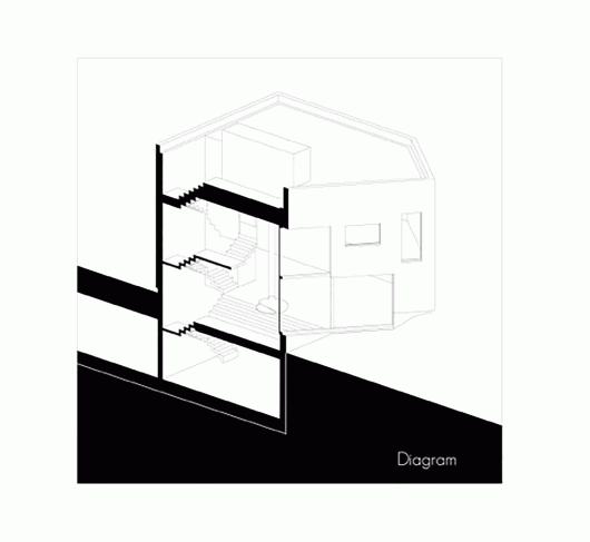
 |
| Section, Source: archdaily.com |
Casa en Praia dos Santos, Ponta Delgada, Portugal, 2013 designed by M-Arquitectos
The elevation disparity from the Main Street to the Avenue creates a
semi buried floor dedicated to the technical areas which has a direct
connection to the Avenue that merges the ocean. The function splits into
two levels: while the ground floor which connects to the main street is
devoted to the social areas, the first floor is reserved for the
private areas. --
ArchDaily
 |
| Source: Oscar Hernández archdaily.com |
C+G House, Aguascalientes, Mexico, 2014 designed by Plastik Arquitectos
....played with the subtraction of elements in base to the lines that drawn
the facade, generating windows and dividing the facade in several
surfaces with distinct orientations that create a game of reflections in
the enamelled sheet that cover the facade --
ArchDaily
 |
| Source: Jeff Wolfram archdaily.com |
 |
| Section, Source: archdaily.com |
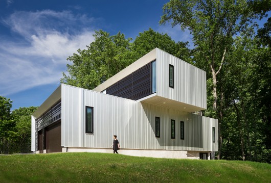
Bridge House, McLean, Virginia, USA, 2014 designed by Höweler + Yoon Architecture
Bridge House is a multi-generational family home that spans both landscapes and age groups. Spaces facing the back of the house feature full panoramic views of the
rear ravine while the opaque materiality of the front elevation creates
privacy from neighbors. Volumes have triple-glazed window walls and
utilize the beveled detail of their tubular geometry to create an
overhang, which minimizes solar gain in the summer and maximize solar
gain in the winter. --
ArchDaily
Mediterranean Villa, Tel Aviv-Yafo, Israel, 2015 designed by Paz Gersh Architects
In designing of the exterior elevations, a framing element is used to capture a segment of the landscape scenery. --
ArchDaily
 |
| Source: Cyrille Weiner archdaily.com |
Maison Le Cap, Var, France, 2015 designed by Pascal Grasso Architectures
They are simple sky-reflecting concrete and glass cubes framed, or rather camouflaged by vegetation. --
ArchDaily
 |
| Source: Amit Geron archdaily.com |
 |
| Plan, Source: archdaily.com |
T/A House, Tel Aviv-Yafo, Israel, 2015 designed by Paritzki & Liani Architects
The T/A house is a three-spanned structure formed from four parallel
walls which create three volumes; these are respectively 3.4, 5, and 2.8
metres high and occupy a long, narrow terrain. --
ArchDaily
 |
| Source: Spaceshift archdaily.com |
Siri House, Suriya Wong, Bang Rak, Bangkok, Thailand, 2015 designed by IDIN Architects
SIRI is a renovation project of commercial building. It is both
a house and an office of jewelry business which belongs to the family’s
third sister. The exterior was designed reflectively to the area of units inside, as
well as the connection of units to each other and to the top level. --
ArchDaily