Wednesday, February 29, 2012

Climbing Up 3

Source: Nico Saieh archDaily.com
Jyvaskyla University, Jyvaskyla, Finland, 1959 designed by Alvar Aalto
Another classic Aalto feature is the stairwell, which is enclosed by a gathering of pine that closely resembles a deeply wooded forrest in the surrounding context. -- ArchDaily
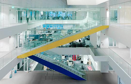
Source: mit.edu
Media Lab Complex, MIT, Cambridge, Massachusetts, USA, 2009 designed by Fumihiko Maki
Both functionally advanced and architecturally distinguished, the complex is an ideal home for technological innovation, design, and the arts at MIT. Inside the new structure’s airy glass and metal framework, nine flexible laboratories are organized around a soaring central atrium. Clustering rows of offices around the labs encourage creative interaction, and transparent partitions offer extended sightlines through the building in every direction, allowing multiple activities to be seen from any vantage point. -- official web site
Read an article from Architectural Record 

Source: Anton Grassl / Esto archdaily.com
The Chazen Museum of Art, Madison, Wisconsin, USA, 2011 designed by Machado and Silvetti Associates
The addition’s main public stair is centered in the lobby. Its orientation and openness create a strong relationship between the entry level and the main gallery level. The stair is formed by a continuous band of stone veneer, which is conceived of as a stone “carpet” running uninterrupted, climbing and folding to create, define, and connect a number of different exterior and interior elements and spaces. -- ArchDaily

Source: Zhang Siye – Zhang Ming – Wang Yuan archdaily.com
Power Station of Art, Shanghai, China, 2011 designed by Original Design Studio
The project interprets the deep relationship between human and art through diverse and complex cultural expression. It also decomposes the traditional single-visiting-path system, and opens multiple-paths system for visitors, creating many possibilities for art exploration. -- ArchDaily

Source: Andrés Valbuena archdaily.com
JWT Bogotá Headquarters, Bogotá, Colombia, 2011 designed by AEI Arquitectura e Interiores
The project was thought as a small city which organization starts basically from a clear ordering principle: a center, a plaza, an important gathering landmark created by two traffic lines resembling main city streets, orthogonal and intercepted. -- ArchDaily

Source: Andy Ryan archdaily.com
BSA (Boston Society of Architects) Space, Boston, Massachusetts, USA, 2011 designed by Höweler + Yoon Architecture
....is centered around a highly visible “cloud” ceiling and an iconic stair. These two architectural elements act as brand markers for BSA Space and an invitation into the exhibits and meeting spaces above. -- ArchDaily

Source: Sergio Grazia archdaily.com
Primary School & Nursery in the “Claude Bernard” ZAC, Paris, France, 2012 designed by Atelier d’Architecture Brenac-Gonzalez
The entrance hall is treated as a flow interchange that highlights the oddly shaped stairways that occupy and cross the empty space. The three-storey atrium clarifies the way the building functions as a whole and shows how the different sections have been superimposed. The monumentality of the entrance hall contrasts with the other areas; it emphasizes movement and creates criss-cross perspectives that lend the design a playful narrative force. -- ArchDaily

Source: Arquitectura en Movimiento Workshop archdaily.com
SDM Apartment, Mumbai, Maharashtra, India designed by Arquitectura en Movimiento Workshop
....the staircase located at the center of the apartment. It was designed as a sculpture in the space with more light and natural ventilation; with very subtle lines but protagonist of the space, it can be seen almost from anywhere in the public areas -- ArchDaily

Source: Wison Tungthunya archdaily.com
VNG Office, Bangkok, Thailand, 2012 designed by Openbox Company
The interior center atrium opens up through all office floors. Staircases were designed as lengthened objects, placed randomly in the middle of the atrium, leaning from one floor to another. Aside from being a composition of objects in space, ones might be reminded of an image of the logging days. -- ArchDaily

Source: Burton Hamfelt Architectuur archdaily.com
MBO College North, Amsterdam, The Netherlands, 2012 designed by Burton Hamfelt Architectuur
The architectural concept is spatial circulation models were each school is both united and separated through a double helix stair concept. What results is an Escher painting like space where the students from each school see each other but cannot be in reach of each other. While each school has it’s own separate entrance and circulation, the teachers enjoy shared facilities such as a canteen, library, library and support functions. -- ArchDaily

Source: Adam Moerk archdaily.com
VUC Syd, Haderslev, Denmark, 2013 designed by AART Architects + ZENI Architects
....it is has been designed as a vibrant and visually engaging educational environment, united by the atrium and the staggered staircase at the heart of the building. -- ArchDaily

Source: Adam Mørk archdaily.com
New Halifax Central Library, Halifax, NS, Canada, 2014 designed by Schmidt Hammer Lassen
The interior of the library reflects the diversity of the exterior with stairs and bridges in the atrium connecting the five storeys. The light-filled atrium gives an overview of the wide range of facilities the library offers, including a 300-seat performance space, two cafés, gaming stations, music studios, dedicated space for adult literacy classes, a First Nations reading circle, and boardrooms for local entrepreneurs. -- ArchDaily

Arquitectura à Moda do Porto: Episode 2, Climbing the Stairs of Porto -- ArchDaily

Source: Luc Boegly archdaily.com

Section, Source: archdaily.com
École Nationale Supérieure Maritime, Le Havre, France, 2015 designed by AIA Asoociés
A spatial continuum develops from the basin to the roof of the building, creating a transition between the water, the ground and the sky. This ascending sequence begins at the quay, opens onto the city with a raised forecourt, and continues with a "stairway street" through the four levels of the structure leading to the upper deck which enjoys panoramic views of the port and the Seine estuary. -- ArchDaily

Tuesday, February 28, 2012

Cube 4

Sammlung Goetz Munich, Munich, Germany, 1992 designed by Herzog & de Meuron
The gallery is a freestanding volume situated within a park-like garden of birches and conifers between the street and a house from the 1960s. A timber configuration rests on a reinforced-concrete base of the same dimension that is half buried so that only its upper glazed perimeter is visible from the outside. A similar matt glass strip surrounds the timber volume at the uppermost section, admitting diffuse glare-free daylight from a height of 4 meters into the exhibition spaces. -- architect's web site
Read a post from ArchDaily 

Source: Architektur-Fotografie Ulrich Schwarz
Youth Centre Amsterdam-Osdorp, Amsterdam, Netherlands, 2011 designed by Atelier Kempe Thill
The realized building consists of the simple stacking of two – diametrically opposed – concepts of space. The ground floor level is designed as a flat sandwich-space, which opens up completely to the surroundings thanks to the glazing on all sides. On the upper floor is the Community Hall. In order to realise the desired multi-functionality and neutrality, it has a fully closed façade and forms a hermetic and introspective space. -- ArchDaily

Monday, February 27, 2012

Urban Elements: Bus Shelters

Source:  JWest Productions archdaily.com
Bus Shelter, Raleigh, North Carolina, USA, 2007 designed by Pearce Brinkley Cease + Lee
The bus shelter is a simple yet refined architectural composition of two materially contrasting elements: a heavy cast in place concrete wall that serves as structure and as a bench, and a steel canopy frame, fabricated off-site, delivered by truck, and set into place. -- ArchDaily

Source: Johan de Groot archdaily.com
Busstop Park+Ride Citybus, Hoogkerk, The Netherlands, 2011 designed by LYVR
The main structure of the building is a domed concrete shell that is incised on three sides. The form knows no right angles, but is composed of circles, arcs and spheres. Inside is a triangular metal core which include a disabled toilet, a utility room and a driver room is included. The central core is also part of the main structure that is self-supporting. -- ArchDaily

Source: herwigphoto.com
A Collection of Striking Soviet Bus Stop Designs -- ArchDaily

Source: Yuri Palmin archdaily.com
BUS:STOP Unveils 7 Unusual Bus Shelters by World Class Architects -- ArchDaily

Source: Yuri Palmin archdaily.com
Bus Stop Kressbad, Krumbach, 6942 Krumbach, Austria designed by Rintala Eggertsson Architects
In our approach to the task of designing a shelter for the bus passengers, we felt therefore compelled to address this important activity by giving the building a second function; a tribune where one could watch a game of tennis on the field.
During our study trip to Bregenzerwald in the early phase of the work we learned about the local building tradition of combining more than one function under one roof – typically the dwelling and the animal stalls. This building typology is seen widely around the area and became soon an important inspiration for us to combine the two functions we had into one building. -- ArchDaily

Sunday, February 26, 2012

Curved Forms 4

Source: archdaily.com
Reflections, Keppel Bay, Singapore, 2011 designed by Daniel Libeskind
The series of high-rise undulating towers is the focal point of this project. These sleek curving forms of alternating heights create graceful openings and gaps between the structures allowing all to have commanding views of the waterfront, Sentosa, the golf course and Mount Faber.
These ever shifting forms create an experience where each level feels unique as it is not in alignment with either the floor above or below. No two alike residences are experienced next to one another or seen from the same perspective; the result of this design is a fundamental shift in living in a high-rise where individuality and difference is not sacrificed. -- ArchDaily

Saturday, February 25, 2012

Zig Zag 4

Source: archdaily.com
Office Building E, Prague, Czech Republic, 2007 designed by Aulík Fišer Architects
A ´broken´ façade is designed facing the source of noise – 5. kvetna street and the access ramp – with strip fenestration. Its moulding was defined by the specific highway curve and the ramp from Vyskocilova (street) in order to prevent reverberation of noise generated by cars passing by towards the above-mentioned houses on the opposite side of the highway.
The designed geometry allows areas of this special envelope to bounce noise away either to the grassed slope between the highway and the ramp naturally absorbing it, or diverting it at a large angle upwards and diffusing it in the open space high above. -- ArchDaily

Source: archdaily.com
Liverpool Department Store, Huixquilucan, Mexico, 2011 designed by Rojkind Arquitectos
The double-layered façade shelters the store and it’s users from its chaotic environment. It’s sleek stainless steel machine-like exterior, is intended to evolve in a very fluid way as the intense sun bathes it throughout the day. It’s a contradiction to the grit and chaos of its sur- roundings; a juxtaposition that becomes a new reference for this part of the city. At night the hollow cavity between the layers of the façade will be engulfed in light that will subtly escape through the fine reliefs formed at the folds in the skin. The façade transforms
at night from its solid monochromatic ap- pearance during the day to a dynamic form accented by light. -- ArchDaily
Second Skin By Michael Cockram -- Architectural Record

Source: Bangkok Project Company archdaily.com
Kantana Institute, Nakhon Pathom Province, Thailand, 2011 designed by Bangkok Project Company
A brick is an everyday material for common cultural heritage of Thai society. The simplified from of the brick is transformed into a universal geometric space. It goes beyond both light and wind which is simple aesthetics sense. It is an easy to understand building where the brick wall does not give the sense of solidity but is gives the surface homogeneous of sunlight. -- ArchDaily

Source: Marcel van der Burg archdaily.com
Siemens Hengelo, Laan Hart van Zuid, Hengelo, The Netherlands, 2012 designed by NL Architects
Hart van Zuid is an industrial area in city of Hengelo. The district is located south of the train station, right in the heart of the city. The area is defined by the typical emblem of 20th century production: the saw-tooth shed. By ‘flipping’ the existing horizontal tissue to an upright position a strangely familiar office building comes into being. The Siemens office basically is a vertical version of the sheds that are at its base. The saw-tooth roof lights turn into glamorous windows. The protruding elements that frame the tilted windows provide a form of sun protection. From the inside the principle works as a visor. The slanted windows reduces glare. And reflections. Like Traffic Control Towers, these offices will have an optimized view. -- ArchDaily

Source: ARTEC Architekten archdaily.com
Multi-generational: Living at Mühlgrund, Vienna, Austria, 2012 designed by ARTEC Architekten
The Vienna rapid-transit line known as U2 originates at Karlsplatz and heads north, crossing the Danube. Parallel and to the south of the elevated tracks, at a distance of 8 to 12 metres from them, is the site of the 7-storey, 90-metre-long, 15-metre-wide building – the allowable massing determined by an urban design competition. ....a vertically kinked skin directs and diffuses the light, and toward the top, combined with a metal wall perforated with window openings, cloaks the building’s ends and the elevation facing the rapid-transit line. This creates a hall within the thermal building envelope (constructed in the passive-house energy standard) with distinctive characteristics: long, narrow and high, with varying incidence of light and a variety of spatial experiences. -- ArchDaily

Source: Grupo ARKHOS archdaily.com
FECHAC Regional Office, Ciudad Juarez, Mexico, 2012 designed by Grupo ARKHOS
First the values that shaped the Community Foundation, which are these four: Giving, Subsidiarity, Solidarity, and Common Good. These four values are represented on the four tessellated aluminum panel volumes that make the area of the building that holds the offices, these volumes are as if they have always being there, they are permanent, unmovable, they don’t change, like four giant stone blocks. -- ArchDaily

Source: EM2N archdaily.com
Extension Railway Service Facility, Herdern, Switzerland, 2013 designed by EM2N
....a three dimensional modulation of the façade. The curvature of the fiber cement elements frees the endless façade from its flat monotony and renders a play of light and shadow. The modulation extends across several elements to form a pattern that fits the enormous size of the building. -- ArchDaily

Friday, February 24, 2012

Urban Elements: Lighting 3

Source: atcasa.corriere.it
Ross Lovegrove’s Street Lights -- Via Dustbowl

Thursday, February 23, 2012

Skin of Architecture: Recycled Parts

Source: architecturetoday.co.uk
Swiss Museum of Transport, Lucerne, Switzerland designed by Gigon & Guyer
The facades of the largely closed volume comprise a rainscreen of metal road signs. These are intended not only to reference the numerous modes of transport that are directed and regulated by such notices, but also to highlight the many localities that are connected via the road network. On the back facade, the signs are reverse mounted with the printed sides facing into the building. The architect explains that the signs are positioned for oncoming traffic, ie visitors arriving from the sides and front of the building, rather than the local residents situated at the rear. -- Architecture Today

Source: popupcity.net
1,000 Recycled Doors, Seoul, South Korean designed by Choi Jeong-Hwa
1,000 recycled doors are enough for the South Korean architect Choi Jeong-Hwa to transform a dull ten-story building into a fresh-looking landmark. This ‘skyscraper’ in the center of the Korean capital Seoul has become a pixelated landmark, that tells the story of thousand people who once chose a fitting color for a door in their apartment.  -- the Pop-Up City

Source: popupcity.net
The Shwopping project, East London, UK
In an effort to recycle clothing and decrease waste fashion, department store Marks & Spencer launched ‘Shwopping’, a project that combines shopping and swapping.  The fashion brand covered a couple of facades of  buildings in hipster town East London with 10,000 pieces of unwanted apparel, resulting in a brilliant, colorful temporary installation that completely changes the face of the buildings and reminds us somehow of an amazing Korean skyscraper with a facade of re-used doors. -- the Pop-Up City

Source: likep.com
Plywood house extension, Silver Spring, Maryland, USA designed by Richard Van Os Keuls
Richard Van Os Keuls has used flattened aluminum soda and beer cans as siding for his plywood house extension, after deciding conventional materials were too expensive.
Van Os Keuls, an architect from Silver Spring, Maryland, first got the idea of incorporating flattened aluminum cans into his trade after seeing a car drive over a discarded soda can. He thought to himself that it would make a pretty decent aluminum shingle, so he began building his own stash of old cans to experiment with, at a later time. That time came around when he finished the plywood extension on his house, and began looking for a cheap material to side it with.
The ingenious architect admits his idea of using aluminum cans has nothing to do with art or the environment, as he was simply looking for a cheap and durable alternative to conventional siding materials. -- LikePage

Source: inthralld.com
Prefabricated Manifesto House, Chile designed by James and Mau Architects
James and Mau Architects came up with an original idea for a prefab home years ago, and the duo has created the “Manifesto House” out of sustainable materials and wooden pallets in a very successful attempt at being green. Built in Chile by Infiniski, this house is dedicated to a cleaner and greener future with the materials used. 85% of the house contains recycled, reused and eco-friendly materials: cork, iron, wood, aluminum, noble woods and eco-ceramics. The best part of it all? It only takes about 3 months to build! -- inthralld

Source: David Armentor archdaily.com
Tulane Students Upcycle Traffic Signs into Shade Canopy , City Park, New Orleans, Louisiana, USA, 2013 designed by Tulane City Center
Tulane City Center and a team of Tulane architecture students worked together with the Lousiana Outdoor Outreach Program to design a shade structure made from traffic yield signs for a challenge course in City Park. Drawing inspiration from the surrounding tree canopy and the structure of the ropes course, the design team crafted a faceted, curving aluminum canopy suspended by steel cables with an earthen berm for seating below. -- ArchDaily

Source: Quang Tran archDaily.com
Vegan House, Ho Chi Minh City, Ho Chi Minh, Vietnam, 2014 designed by Block Architects
The old windows were used as the main material to create a distinctive appearance. These windows have been used in Vietnam for a long time because of its ventilation. They are now rearranged into a new facade with different colors and cover the old facade, wrap it up to the rooftop and create a special attraction, as well as harmonizing with the ancientness of entire area. -- ArchDaily

Wednesday, February 22, 2012

Urban Spaces: Esplanades

Source: architecturetoday.co.uk
Lifting Wave, Resting Wave, Lighting Wave, Dover, UK designed by Tonkin Liu
Lifting Wave, Resting Wave, Lighting Wave harnesses the architectural language of Doverʼs identity, evoking the gentle nature of waves on the sheltered beach, the rhythmical sweep of the Georgian seafront terrace and the topography of the White Cliffs. -- Architecture Today

Source: Alejo Bagué archdaily.com
Benidorm Seafront, Benidorm, Spain designed by OAB
The artifical landscape elegantly resolves the problem of the required width of a seaside promenade by having the form expand to larger areas with benches and places to relax.   The design also includes a variety of access points to the sand. In this way, the design serves different levels, as the upper level is fit for any city-goer to meander along the path, and the bottom curves pour into a wooded board walk for runners and beach-goers. On the upper level, the colored promenade has a passive relationship with the Mediterranean, and the curves of the form provide a shaded perimeter for the lower path. The design truly fits the location as the seaside is filled with people enjoying their holiday.  Its upbeat color selection and dynamic form have made it a success for those from or visiting Benidorm. -- ArchDaily

Source: Robert Blackie archdaily.com
Copacabana Beach Boardwalk, Rio de Janeiro, Brazil designed by Roberto Burle Marx
famous mosaic sidewalks of the Copacabana Beach Boardwalk designed by the Brazilian landscape architect Roberto Burle Marx -- ArchDaily

Source; construction.com
Promenade Samuel-de Champlain, Quebec, Canada, 2008 designed by Daoust Lestage, Williams Asselin Ackaoui, and Option Aménagement
.... what had once been a largely industrial landscape dotted with petroleum storage tanks is now a leafy linear park filled with pedestrians, runners, and cyclists. This 1.5-mile-long, $63 million (U.S.) section of the Promenade Samuel-de Champlain is part of a vision for a continuous emerald swath that will eventually extend another 6 miles to an area of shoreline near the fortified walls of the Old City.
.... By introducing gradual curves and pulling the four-lane artery away from the shore at a few key spots, the team was able to recover significant stretches of the waterfront for public use -- Architectural Record

Tuesday, February 21, 2012

Inspiration vs. Imitation

Who is BIG?
Some student in TUDelft (NL) hung on the Faculty’s corridors’ walls a funny poster in which two famous buildings are portrayed: at left there is the Mountain Dwellings by BIG, 2008, while in the right side we have the Office Building Centraal Beheer in Apeldoom, Herman Hertzberger, 1972. Beside the malicious thought that may be behind this association of pictures, a deeper reflection arises almost spontaneous. Where is the limit of the “inspiration” and “imitation” or between “copy” and “improvement” that may be between two architectures realized by different architects, with different purposes, period and location? -- TheArchHive

the old new: urban dwelling
Looking through another Best Building of the Year 2009 Award Winner, gave me that “I-think-I’ve-seen-it-somewhere” though. But urban dwelling is a timely issue at any decade and here improving the old concept can be only beneficial. -- design apothecary


Architectural Patents: On what Grounds?
Apple successfully getting an architectural patent for the design of a store in the Upper West Side in New York City, asking “On what grounds can you patent architecture?”  The inventors listed in the patent are architects Karl Backus, Peter Bohlin and George Bradley of Bohlin Cywinski Jackson, and Robert Bridger, Benjamin L. Fay, Steve Jobs and Bruce Johnson for a design that Architect’s Newspaper describes as “meticulous and seamless as its clients”. -- ArchDaily
Trademark Awarded to Apple Retail Stores
Apple has successfully been awarded a trademark for the “design and layout” of their retail stores. Since opening their first in Virginia over a decade ago, their stores have been at the heart of the companies branding; with the late Steve Jobs heavily involved in their design.  -- ArchDaily

Source: popupcity.com
Clone City: Austrian Village Erected In China
.... an identical clone of Hallstatt, a UNESCO World Heritage Site located on Austria’s Hallstätter See. Not a single detail was left out on the perfect simulacrum, including building details and major monuments. Simulacritecture at its absolute finest, one could say. What does this mean for urban design, anyway? We generally think of urban planning as a slow process, adding buildings to our urban environment in a piecemeal way. But these ancient(-looking) structures can pop-up pretty quickly, as was the case here. -- the Pop-Up City
Read a post from ArchDaily

Source: East © ZHA archdaily.com
Zaha Hadid Seeing Double in China
Unfortunately, Hadid has found herself in a race to finish the Wangjing SOHO office and retail complex in Beijing before pirates complete their doppelgänger version in Chongqing, a megacity near the eastern edge of the Tibetan plateau. -- ArchDaily
Why China’s Copy-Cats Are Good For Architecture -- ArchDaily

Video: Inside a Chinese, Parisian Ghost Town -- ArchDaily

Monday, February 20, 2012

Floating Roofs 8

Source: Jeffrey Jacobs Photography archdaily.com
MATA South Intermodal Facility, Tennessee, USA, 2010 designed by brg3s architects
The west side of the building has a 30 foot deep roof overhang covering nine Greyhound bus spaces for passenger arrival and departure. This canopy has a continuous skylight roof monitor to bring natural light to the walkway next to the building. -- ArchDaily

Source: John Edward Linden archdaily.com
Contemporary Art Museum, Raleigh, North Carolina, USA, 2010 designed by Brooks + Scarpa, Clearscapes
The dramatic lobby is a glass-enclosed space set beneath a spectacular folded-panel roof that extends over the entry’s sculpture garden to form a kind of welcoming front porch.  -- ArchDaily
Read an article from Architectural Record

Source: Miguel de Guzmán archdaily.com
Avila Hospital, Ávila, Spain, 2010 designed by EACSN
The original building was built in the 1950’s; it is a low rise pavilion structure located within a large plot in the first area of expansion of the city of Avila. The extension fits in the typology of the existing complex, which is actually very similar to current trends in healthcare architecture. We built two new ward pavilions placed between the existing main circulation gallery and a new internal circulation parallel to the first one, with a new vertical communication nucleus. -- ArchDaily

Source: John Gollings archdaily.com
Annexe, Ballarat, Australia, 2011 designed by Searle & Waldron Architecture
A modulated roof scape and painted timber linings recall roof forms of Ballarat’s 19th century back of house spaces where humble, timber lined, saw-toothed additions stand in contrast to the grand facades of the main streets. A singular augmented horizontal plane running inside to out, the roof defines the space while emphasising framed views across the condensed volume between ceiling and plinth. -- ArchDaily

Source: Timothy Hursley archdaily.com
AIANC Center for Architecture and Design, Raleigh, North Carolina, USA, 2011 designed by Frank Harmon Architect PA
The siting, narrow form, and abundant glazing – including operable windows — maximize natural ventilation and light in every interior space. Other sustainability features include: Deep roof overhangs and porches to shade the building in the summer but allow warming light in the winter -- ArchDaily

Source: Nico Saieh archdaily.com
Boulevard Las Brujas, La Reina, Santiago Metropolitan Region, Chile, 2012 designed by Mas Fernandez Arquitectos
The large covering that wraps the volumes that contain shops, helps to give the building a strong appearence, leaving the billboards captivated by architecture. -- ArchDaily

Source: David Sievers archdaily.com
Thebarton Community Centre, Thebarton, Adelaide, Australia, 2013 designed by MPH Architects
....be a focus for the community, and a landmark as the northern gateway to the council area. The dominant built form with folded roof planes references movement, flight and the City of West Torrens as a transport hub. -- ArchDaily

Source: MVSA Architects archdaily.com
Offices Schiedam Jumbo & Wärtsilä, Havenstraat 23, 3131 BD Vlaardingen, The Netherlands, 2013 designed by MVSA Architects
The volumes are rounded off by roof awnings that extend far out from the building to provide shading from the sun. -- ArchDaily

Source: Pedro Kok archdaily.com
Groenlândia, Rua Groenlândia, 1157 – Jardim América, São Paulo – SP, 01434-100, Brazil, 2014 designed by Triptyque Architecture
Triptyque wanted to emphasize the stiffest materials such as marble and concrete to challenge them with the gravity. Groenlandia links together stone and glass, rigidity and transparency, durability and lightness. The deck, a large slab of concrete whose the wooden floor floats from over 9m, above a block of white marble. -- ArchDaily