 |
| Source: UNI archdaily.com |
XS House, Cambridge, Massachusetts, USA, 2006 designed by UNI
this is, three rotated 16-by-22-foot boxes with four-corner-skylights, giving rooms natural light with minimum windows and maximum privacy, something that is all too important when there are four houses on just two lots, especially when the designs draw as much attention as they do. -- ArchDaily
 |
| Source: Sapa: Architectural Aluminium Solutions |
Broadcasting Place, Leeds, UK, 2009 designed by Feilden Clegg Bradley Studios
Through this massive form, windows were conceived as the flow of water cascading through a rock formation. This design intent is reinforced by the selection of cor-ten steel as a solid, sculptural and weathering material, constructed as a rain-screen façade. -- ArchDaily
 |
| Source: Trevor Mein archdaily.com |
Seven17 Bourke Street, Melbourne, Australia, 2009 designed by Metier3 Architects
Protruding through the level 4 public domain on the podium the office tower proper rises a further 14 floors, sheared at alternate levels. The articulation of the facade aids in the mitigation of the `reverent Docklands winds, causing the wind to skirt around the building rather than down the face onto the public spaces. Sheathed in a skin of high performance glazing the facade is articulate firstly via an applied fit and secondly with a random fins – both of which assist in the reduction of glare and heat load internally. -- ArchDaily
 |
| Source: Jerome Ricolleau archdaily.com |
Herouville-Santi-Clair Hotel, St Clair, Michigan, USA designed by Platform Architectures
The symbolic element of the project, the subtle game of piling up and shifting masses, generates an unease in the spectator: it is a delicate attack on the basic laws of gravity. The building is designed to be read from two perspectives: firstly there is the base, which follows the lines of force of the town and landscape, and then there is the assumed and asserted verticality. -- ArchDaily
 |
| Source: Patrick Reynolds archdaily.com |
Ironbank, Auckland, New Zealand, 2009 designed by RTA Studio
The building presents a glass reinforced concrete (GRC) façade as a ‘veil’ to the high street edge screening the site’s interior. This screen has been conceived as an abstraction of the historical facades adjacent.
In a gesture to the finely scaled historical neighbourhood, we have sought to fragment the building form to alleviate the potential mass associated with a medium sized office building. Hence, 5 towers are further fragmented vertically to articulate the composition of stacked office and retail spaces gathered into a socially sustainable working community. -- ArchDaily
 |
| Source: Tomaz Gregoric archdaily.com |
Basket Apartments, Paris, France, 2012 designed by OFIS architects
Each volume contains two different faces according to the function and program: The elevation towards the street des Petits Ponts contains studio balconies-baskets of different sizes made from HPL timber stripes. They are randomly oriented to diversify the views and rhythm of the façade. Shifted baskets create a dynamic surface while also breaking down the scale and proportion of the building. -- ArchDaily
 |
| Source: Sharyn Cairns archdaily.com |
The POD, Lorne, VIC, Australia, 2012 designed by Whiting Architects
Break building into small component parts like stacked boxes. Use natural topography to advantage. The ‘Pod’ building is an anchor point for the site with crates in timber & concrete randomly stacked as if ready for loading and dispatch by sea. -- ArchDaily
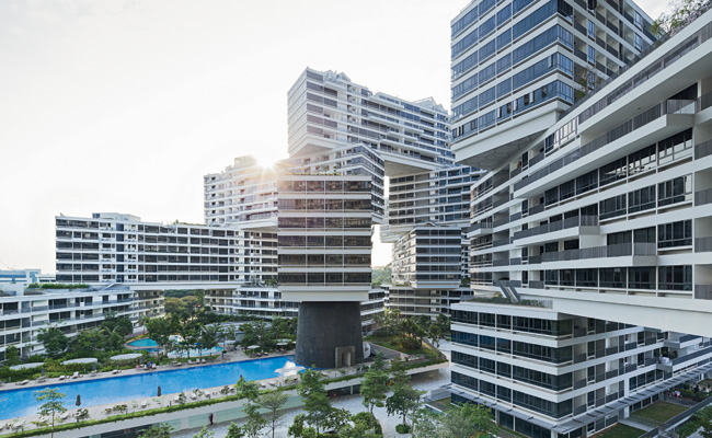 |
| Source: Iwan Baan archrecord.construction.com |
The Interlace, Singapore, 2013 designed by OMA
It is a breathtaking one, made up of 31 six-story rectangular blocks that appear woven, and are arranged on top of each other at angles. The flush, white-painted concrete facades are occasionally interrupted by slender horizontal balconies, from which greenery will cascade as it grows. The building snakes around and through its roughly rectangular 20-acre site like a line of toppled dominoes. -- Architectural Record
 |
| Source: Luis Ferreira Alves archdaily.com |
Cantareira Building, Porto, Portugal, 2013 designed by Eduardo Souto de Moura
The building highlights throughout its exterior design the usual overlap of the different plans that compose it. This superposition of different levels is marked on the south and east elevations through an alternative and independent rotation of the four facade planes. -- ArchDaily
 |
| Source: Adam Mørk archdaily.com |
New Halifax Central Library, Halifax, NS, Canada, 2014 designed by Schmidt Hammer Lassen
The exterior of the library appears as four rectangular shapes placed on top of one another and horizontally twisted to relate to the two diagonal directions that are dominant in the otherwise orthogonal grid of the city. -- ArchDaily
 |
| Source: Mariana García archdaily.com |
High Park, Avenida Manuel Gomez Morin 922, Zona Santa Barbara, Mexico, 2015 designed by Rojkind Arquitectos
In order to react against the intensive sun, the floor plates shift from one to the other playing a game of light and shadow. At the same time, the use of local stone on the façade, made by local craftsmen, keeps the building cooler and creates a dynamic appearance that changes as the sun moves across the horizon. -- ArchDaily
No comments:
Post a Comment